If you’re interested in discussing my work, reach out to me at matthew.s.miller@icloud.com
If you’re interested in discussing my work, reach out to me at matthew.s.miller@icloud.com

The concept of Star was for a modern application for Whole Foods Market stores that would be used for auditing, requesting marketing materials, and querying items by various store users. This application replaces outdated software that had become cumbersome to use and unstable over the years. We saw this as an opportunity to redesign the application from the ground up.
The design allows the user to jump between features quickly and easily while on the sales floor in a fast paced dynamic atmosphere. The previous application required users to jump through hoops to switch modes, requiring passwords to be entered each time. This was a pain point that we wanted to address by speeding up the user’s process and empowering them to quickly jump between tasks when needed.
For this project I conducted initial user research, gathered current business processes, and created user stories for the new application. I also created prototypes and ran user testing sessions with users.
In our first meeting with key decision holders we identified current process obstacles and pain points. We set the goals of this redesign, established minimum requirements, and defined the target audience.
Once we had discovered our needs, I began prototyping the new design. My work focused on providing all the required information a Whole Foods team member would need, in an easy to read format. Throughout the process I presented the designs to the stakeholders for feedback. Using their feedback I further refined the application.
I conducted user testing sessions with 4-5 potential users where gather insight about the overall usability and functionality.
There had never been a transparent method for stores to lookup detailed information about a product. The Item Lookup feature allows a user to not only confirm the current pricing but also see the ingredients list, find out if the item is gluten free or organic, and numerous other details.


Every week a random sampling of items that are made in-house are weighed for accuracy, which verifies items are being packaged properly in each department. The weight of the product and packaging (tare) are input into Star by the auditor. The results are displayed immediately so action can be taken if issues arise.
Since our team wasn’t provided the certified hardware devices for Star, I had significant challenges with testing. It proved how important it is to have the same equipment as the end user.
I also realized that I over anticipated the need for users to actively jump between different features. We built in the persistent buttons at the top, thinking that users switch between tasks frequently, which was based on their feedback of the obsolete system. But after rollout, we learned that deviating from a task is not that common and the buttons crowded the rest of the application.
The goal of this application was to serve as a centralized system where all new items, item changes, price changes, and general issues are submitted, reviewed, and implemented, establishing a single point of entry with a consistent experience to improving the day to day operations of the company.

Whole Foods began a major restructuring process to unify and simplify a large number of processes that had previously been inconsistent, redundant, inefficient, and used differently by each of the company's regions. Numerous SharePoint sites were being maintained, or not maintained, which led to a lack of visibility into completion times and an overall poor experience for the various users. A single request could be directed to several additional sites which would delay the completion process and make it difficult for the submitter to follow their request and know its current status.
As our team strategized each feature of the application, I performed user tests to verify our design, allowing us to make refinements as we went.
From the beginning of our work, we knew we needed to create a clear and simple application. One that was easy to understand and didn't require extensive instructions or training sessions. It should be intuitive, as this application is used by a wide variety of users:
store teams
regional product teams
regional data teams
global data teams
global product teams
Our testing showed our store users may have limited computer skills so we knew we wanted to provide a simple and clear interface that would be understandable by the most novice of users.
A second issue that became apparent was a terminology discrepancy. Data teams made references based on legacy databases while stores users called out terminology of register errors. We developed different methods to address these issues, from aligning terms whenever possible to allowing the application to have custom headers for each section based on user groups.

For each enhancement my team began by assessing the current steps users were going through to accomplish the desired tasks. Processes varied in each department and often revolved around gathering information from multiple applications. Users rarely had a clear expected timeline for completion. I developed user stories in order to contextualize the user’s behavior and guide the application design. From there, I created wireframes that gave an initial visual to the project. I performed a small scale user test, to find any usability issues before creating more detailed prototypes.
Even now, as we continue to update the application, we bring users into the development process to ensure we are providing a clear and intuitive experience.
One particular challenge was the Item Maintenance Request workflow, which required a variety of routing stages. Each different type of item change required a different approval and implementation process depending on the origin of the request, the changes being made, and who was responsible for approving and completing each task. We created user journeys to account for the different user persona in order to visualize the workflow steps. See simplified information architecture diagram below:

Workflow designed for Item Maintenance Requests. Tasks are directed based the Settings page.
In addition, by developing a customizable Settings page, site administrators are able to adjust the workflow to meet their ever changing business needs. In the example below, the site administrator can highlight in blue to direct implementation to Regional teams, and brown to direct to Global teams.

The Settings page allows the site administrator to determine approval and implementation for each task. By allowing this to be set within the application, there is greater flexibility as business practices evolve.
Lastly, we needed to develop this application to encompass a supported integration with legacy systems. Therefore, we developed a function that allows for flexibility when Regional or Global teams create export files which are ultimately imported into the legacy database. Depending on the intention of the initial request, they can choose from a compact or expanded file to export.

After a decision was made to decommission existing product maintenance systems, my team was tasked to develop a replacement process within our current application structure. We would essentially build the portal through which all new item information was shuttled to multiple internal databases. In other words, this New Item Submission process we created would be the entry point for all items being brought into Whole Foods Market. Our main goal for this new system was to streamline the procedure and improve the experience of our internal users with a simplified process.
Objectives:
Simplify the current multiple stage approach
Handle large volumes of data
Prioritize functionality over aesthetics
Perform foundational research
Create information architecture
Design prototypes
Develop user stories
Conduct user testing sessions
Foundational Research
In the initial stage of the project, my team and I started with a fact finding mission, researching the existing processes. I identified multiple points where delays occurred, which stemmed from the various handoffs between teams and databases that occurred after submitting a new item request. It caused an extreme slow down in the workflow.
In assessing the current process, I interviewed a group of users: Does the process serve your needs? What do you find most challenging about the current process? This provided me with key insight that our users were looking for an intuitive process that provided a single entry point and a quicker set-up time.
Prototyping
Each New Item Submission requires a large amount of information, which presented an initial layout challenge. Because of this we determined that our design should function similar to a spreadsheet. This provides the user easy ways to add a large amount of data very easily. Using card sorting exercises I was able to define groups of like-items that could be grouped by specific characteristics. This guided my design process and help created a simplified layout.

Wireframe
My initial wireframes were designed to show the overall functionality of the application. This gave us a simplified visual that allowed us to show it to potential users for feedback.

One of many iterations
After the wireframes were workshopped, I used the feedback to make adjustments and work on the design. Because we were working within an established application, I was able to reuse existing components to make design decisions easily while also providing a more consistent user experience.

Final design
I went through multiple iterations to provide the simplest view while showing all the required information. In order to save horizontal space, the page tabs were moved from the side panel to be tabs above the main form. By continually assessing the design, I was able to gather valuable usability feedback and continue to refine the functionality.
Architecture
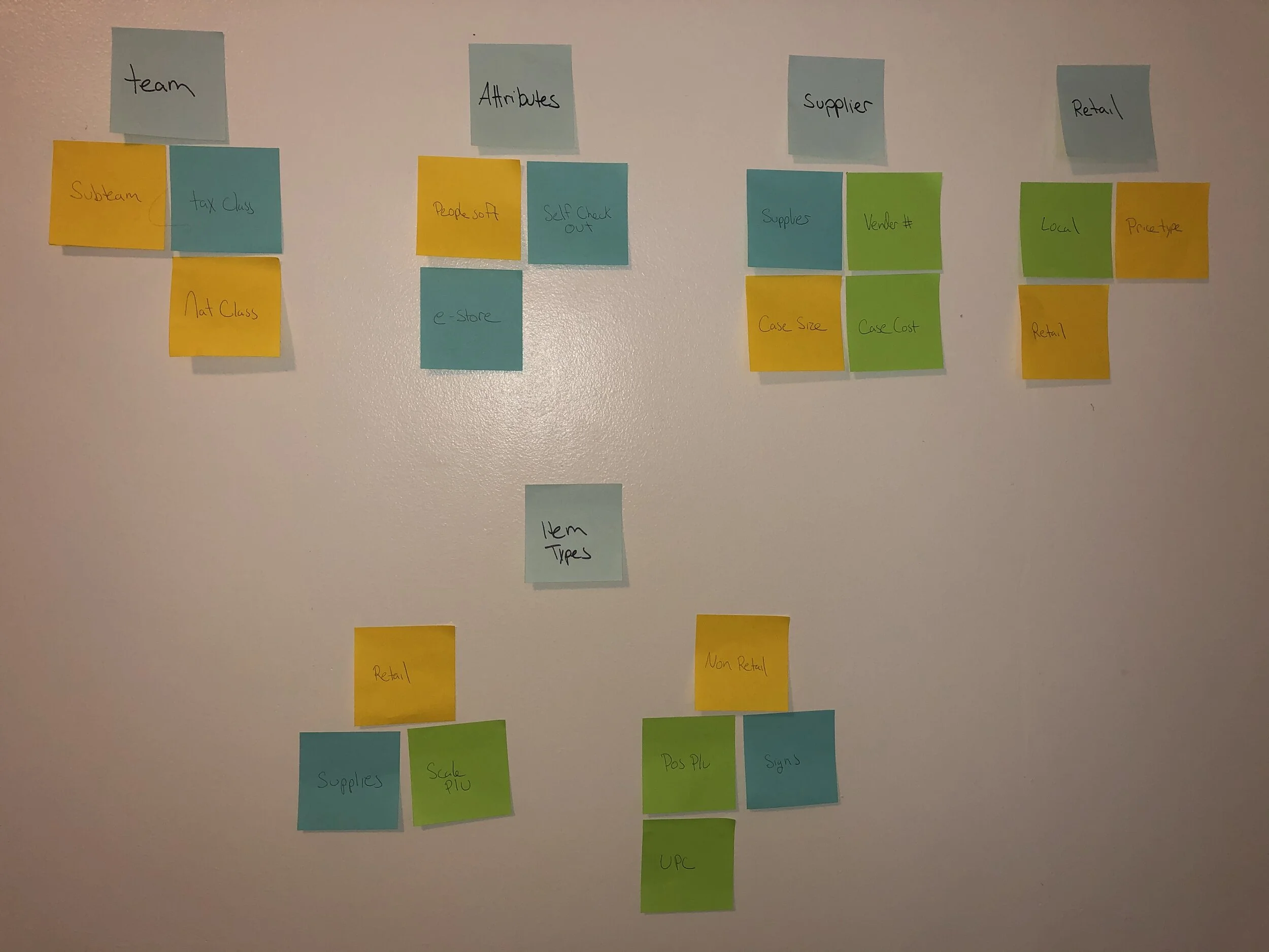
Another aspect of this project required a significant amount of work behind the scenes. The New Item Submission process requires connection amongst several different databases. The handoffs between these applications had to be defined and clearly laid out to make sure that all information was passed along in proper order. I also designed the program to automatically assign specific attributes such as bottle deposits and tax classes.
Design
I used the existing design style and colors used throughout the application in order to maintain consistency throughout the application. We have a redesign planned for a future release that will improve the overall aesthetic and support greater accessibility needs.
After running a pilot I found I was able to reduce submission and completion time by 65% when compared to the previous processing time. We’ve also improved customer satisfaction, as feedback from various departments (from grocery to spirits to produce) has all been overwhelmingly positive.
One key take-away from this project was deciding when to deliver a Minimum Viable Product. Because several complexities were scoped into the application from the beginning and because development of those features delayed our initial release, we realized that it slowed the initial adoption of the new process. This reinforced the idea that a project rolled out in stages can, at times, be beneficial.